Article Text

Abstract
Background Atrial fibrillation (AF) is a common cardiac arrhythmia which is a major risk factor for stroke, transient ischaemic attacks and increased mortality. Primary care management of AF can significantly reduce these risks. We carried out an evaluation to asses the usability of an AF dashboard developed to improve data quality and the quality of care.
Method We developed an online dashboard about the quality of AF management for general practices of the Oxford Royal College of General Practitioners Research and Surveillance Centre network. The dashboard displays (1) case ascertainment, (2) a calculation of stroke and haemorrhage risk to assess whether the benefits of anticogulants outweigh their risk, (3) prescriptions of different types of anticoagulant and (4) if prescribed anticoagulant is at the correct dose. We conducted the think aloud evaluation, involving 24 dashboard users to improve its usability.
Results Analysis of 24 transcripts received produced 120 individual feedback items (ie, verbalised tasks) that were mapped across five usability problem classes. We enhanced the dashboard based on evaluation feedback to encourage adoption by general practices participating in the sentinel network.
Conclusions The think aloud evaluation provided useful insights into important usability issues that require further development. Our enhanced AF dashboard was acceptable to clinicians and its impact on data quality and care should be assessed in a formal study.
- primary health care
- medical informatics
This is an open access article distributed in accordance with the Creative Commons Attribution Non Commercial (CC BY-NC 4.0) license, which permits others to distribute, remix, adapt, build upon this work non-commercially, and license their derivative works on different terms, provided the original work is properly cited, appropriate credit is given, any changes made indicated, and the use is non-commercial. See: http://creativecommons.org/licenses/by-nc/4.0/.
Statistics from Altmetric.com
Summary box
What is already known?
Atrial fibrillation (AF) is a major risk factor for stroke, transient ischemic attacks; Primary care management of AF can significantly reduce these risks.
Clinical dashboards assist clinicians, and managers to monitor and improve the quality of care of atrial fibrillation.
What does this paper add?
We demonstrated the use of the think aloud protocol for evaluating the usability of a dashboard used in a primary care setting.
AF management choices and quality (prescribing) sections were found to be the most useful indicators for clinical practice.
Introduction
Clinical dashboards integrate large volumes of routine data into a simple accessible format, and are intended to assist clinicians and managers to monitor and improve the quality of care.1 2 Dashboards have been used in primary care for a range of functions such as improving data quality and prevention,3 to improve the quality of surveillance4 and to promote medication safety.5
Evaluation of these dashboards should include a rapid communication on the quality achievement to their target audience. Formal usability studies also assess whether target users of a system interact with it as intended by the designers.6 Systematic usability testing and subsequent enhancements increase the possibility of tools being successfully integrated into routine clinical workflows, providing greater efficiency, and ultimately in quality improvement.7 8
Atrial fibrillation (AF) is one of the the most common and important heart arrhythmias; if undetected and left untreated, it can result in stroke and increased mortality. Early recognition of AF in practice can lead to early intervention with managing the risks of these complications. Current guidelines on the management of AF by National Institute for Health and Care Excellence (NICE), UK advises identifying and managing the underlying causes of AF, treating the arrhythmia and assessing and managing the risk of stroke in these patients.9 Clinical prediction scores such as CHA2DS2VASc predict the risk of thromboembolic disease including stroke10 and guide whether the benefits of commencing anticoagulation treatment outweigh risk. The risk of starting a patient on anticoagulation include assessing bleeding risk, for example, using the HAS-BLED score. While components used for calculating CHA2DS2VASc and HAS-BLED risk scores are well recorded, risk scores themselves are poorly recorded resulting in a gap in data quality. Anticoagulation therapy aims to reduce the risk of thromboembolic events. This has been achieved by the use of vitamin K antagonists, primarily warfarin, for many years. The introduction of direct oral anticoagulants (DOACs) such as apixaban and rivaroxaban to clinical practice has changed how AF is managed. DOACs have similar or better mortality and vascular outcomes than warfarin,11 and the added benefit of requiring much less monitoring than warfarin.12 However, the dosage regime varies between the different DOACs and is complex; errors are common and are associated with hospital admission.13 In the UK, the Quality and Outcomes Framework (QOF), a pay-for-performance scheme (P4P), was introduced to provide incentives to incentivise general practitioners to achieve indicator thresholds for managing chronic diseases.14 This has made a significant improvement to enhancing the quality of AF data being recorded in primary care during the last decade.
We developed an interactive dashboard to provide feedback data quality and the quality of AF management in primary care at the individual general practice level within the Oxford Royal College of General Practitioners (RCGP) Research and Surveillance Centre (RSC) sentinel network. The aim was to provide a tool for general practitioners to monitor data quality on a weekly basis. We carried out this study to evaluate its usability in primary care.
Method
Creating the AF dashboard
We used our generic approach to creating clinical dashboards for a single condition. The use interface requirements and data requirements for the dashboard were developed by practising general practitioners who were members of the study team. This involved identifying data in four sections: (1) Case ascertainment—incidence, prevalence, standardised prevalence and any indicator-related (P4P) prevalence; (2) Indications for therapy and risk factors; (3) Management choices; (4) Quality. We generally avoid more than four to five areas of feedback to avoid overload. The indicators for each section and clinical codes that represent the variables were identified. These clinical codes were used to extract an initial dataset used for developing the dashboard.
We developed the dashboard using Tableau data visualisation software (V.2019.1) which allows data-driven development of dashboards. The initial dashboard was hosted on the public dashboard cloud server and accessed a publicly accessible database server (located within our University IT infrastructure) which hosted only aggregated data to comply with information governance requirements.
Think aloud evaluation
The user interface of a dashboard needs to be evaluated for its usability to ensure a user-friendly and engaging experience. Although questionnaires are the most commonly used method for capturing usability feedback, it has the limitation that feedback is captured after the user interaction has taken place.15–18 By contrast, the think aloud provides insight into a system user’s cognitive process while carrying out a task.19 20 We used the think aloud method to validate the usability of the AF dashboard. During usability testing, study subjects are instructed to verbalise their thoughts while concurrently conducting predefined tasks on the dashboard.21
We designed the think aloud session to consist of five tasks. Participants were asked to verbalise their cognitive process while engaging in the tasks and avoid describing the reasons for their actions.22 During the initial four tasks, we asked participant to observer the four main sections of the dashboard. We asked them to observe the given information and interpret with respect to that particular aspect of AF management in their practice. As the fifth task, we asked the participant to observe the complete dashboard and describe the overall state of AF management in their practice in comparison with the RCGP RSC sentinel network.
Subjects
We invited staff from all general practices participating in the RCGP RSC sentinel network (ie, 320 practices at the time of conducting the study) through the practice newsletter. From those who expressed interest, we invited staff from general practices to cover a range of roles. Participants represented 15 practices located across England. None of the participants were involved in the initial requirement gathering/design of the dashboard. Roles of primary care staff recruited as study participants included general practitioners, nurses and practice managers. We also included clinical researchers and hospital consultants who had expertise in AF as participants. Participants who were not able to attend in person joined using the Gotomeeting remote screen sharing software which also allowed recording screen activity. We aimed to recruit a sample of 20–30 subjects for this study based on guidelines of a previous study.23
Data capture and analysis
We recorded participants’ feedback and screen activity using Gotomeeting screen sharing software (V.10.5). The audio component of the recordings were exported and transcribed by a professional transcription service. The transcripts were analysed using NVivo (V.12) qualitative analysis software.
We used grounded theory as our analysis approach. We ensured robustness in our analysis by following a documented logical analysis flow which included two templates. The completed templates were reviewed by a peer researcher to reduce bias of the person conducting the mapping exercise. The following three-step approach was used to analyse the transcripts.
Mapping verbalised tasks to sections: Each verbalised task description was extracted and mapped to the corresponding section of the dashboard. We define a ‘verbalised task’ as the verbal feedback given by the user when performing an interacting with component in the dashboard. The verbalised tasks were mapped to the dashboard sections and similar feedback were grouped (online supplemental table 1).
Mapping verbalised tasks to usability problem classes: For each section, we mapped the verbalised tasks to matching usability problem classes. We adapted the usability problem classification method used by Peute et al and identified occurrences for each usability problem class.21 The usability problem classes include visibility of system status, error messages/help instructions, meaning of labels/graphs, layout/screen organisation and dashboard controls. Furthermore, we classified the identified verbalised tasks based on whether they were positive feedback, negative feedback or suggestions for new features (online supplemental table 2).
Summarising usability issues across sections/usability problem class: The results table generated by steps 1 and 2 were further condensed to understand sections of the dashboard and type of usability problem which required needed to be addressed.
Supplemental material
Enhancing the AF dashboard
The analysis of the dashboard informed which sections required improvements in the user experience. The enhanced dashboard was deployed to general practices in the RCGP RSC sentinel network. We informed general practice staff about these enhancements through user training and updated to dashboard user manuals.
Ethical considerations
Personal data were not collected from the study participants. We obtained informed consent from participant for recording verbal response and screen activities. All participants received oral and written information about the study. We used the HRA decision tool to confirm that no NHS REC ethical approval was required for the study.
Results
AF dashboard
Creating the AF dashboard
We used our generic approach to identify four areas which would give an overview of the quality of AF management: (1) Case ascertainment, (2) Calculating stroke and haemorrhage risk to assess whether the benefits of anticoagulants outweigh their risk,24 (3) Decision to anticoagulate and choice of type, and (4) Prescribing an anticoagulant at the correct dose.25 We developed a dashboard with four sections that corresponded to our generic approach.
Case ascertainment
This section displays the prevalence and incidence of AF within the practice of the participant and this was also compared with practices in the rest of the RCGP RSC sentinel network (figure 1).
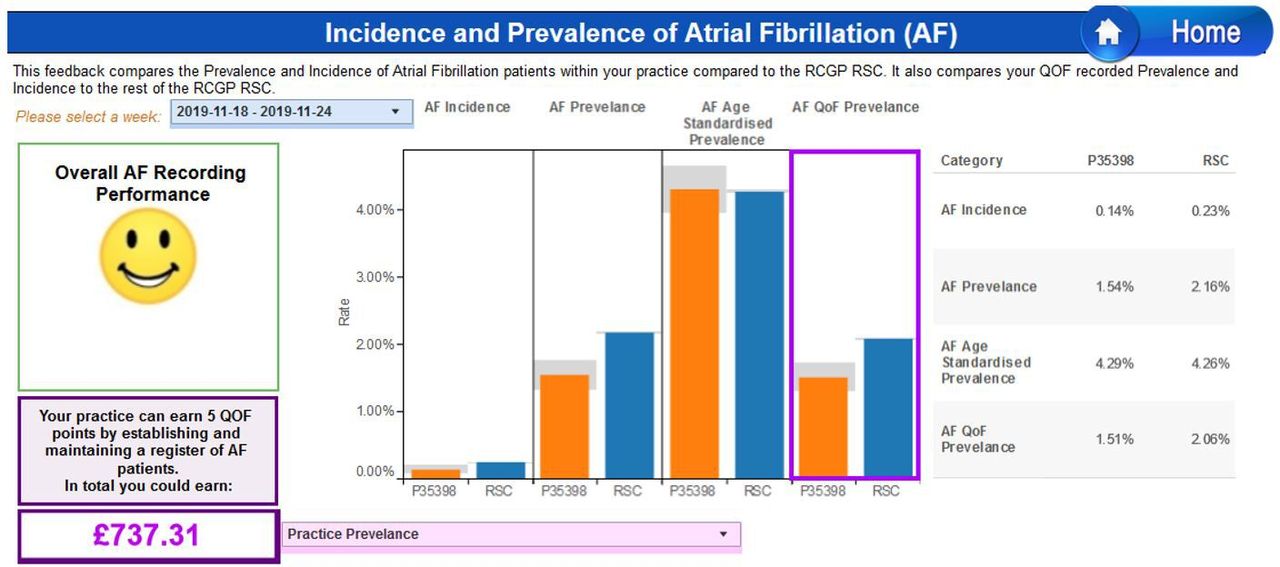
Screenshot of dashboard section for case ascertainment of incidence/prevalence.
Indications for therapy and risk factors
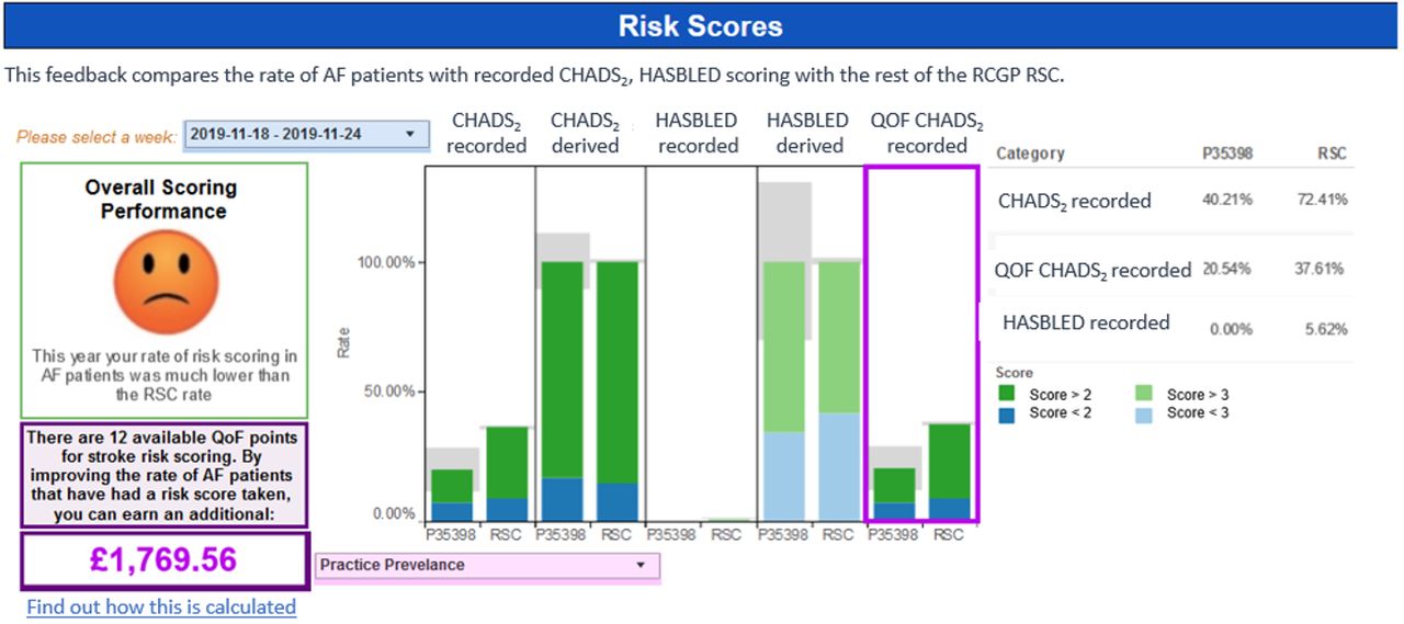
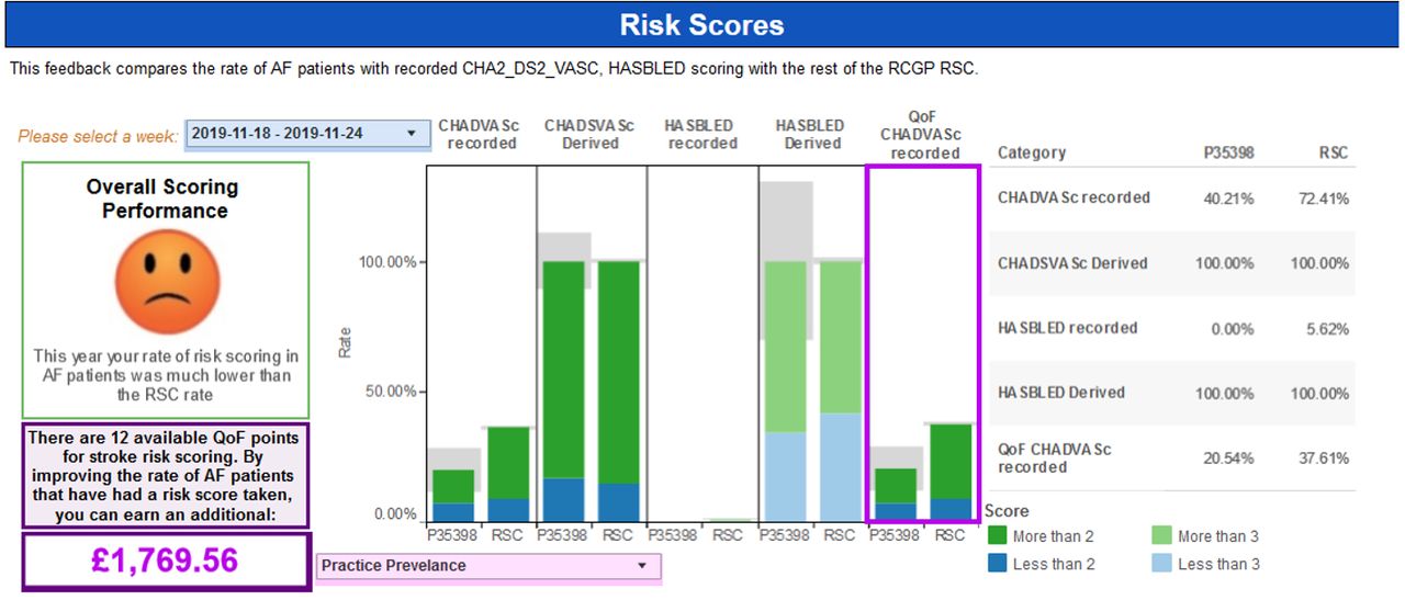
This section displays levels of recording of stroke and haemorrhage risks (CHA2DS2VASc scores and HAS-BLED scores) for patients with AF with indication about potential risk score records which can be achieved. NICE guidelines require practitioners to complete CHADVASc scores and HAS-BLED scores for patients with AF (figure 2).

Screenshot of dashboard section for calculating stroke and haemorrhage risk.
Management choices
Decision to anticoagulate and choice of type is considered in this section of the dashboard. Anticoagulation prescribing levels are given with comparison with overall prescribing in the RCGP RSC sentinel network. All patients with AF with a CHA2DS2VASc score more than or equal to 2 should be offered anticoagulation (unless they have an increased bleeding risk) according to NICE guidelines (figure 3).
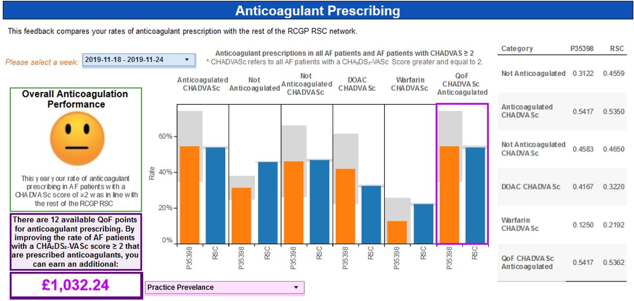
Screenshot of dashboard section for anticoagulant prescribing.
Quality
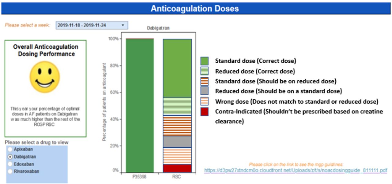
This section displays anticoagulation prescribing at the various doses. Different combinations of doses prescribed are displayed for each of the four commonly prescribed four DOACs (figure 4).

Screenshot of dashboard section for anticoagulant doses.
Uptake of the AF dashboard in general practice
We hosted the AF dashboard as a part of the MyPracticeDashboard: a collection of five dashboards that inform participating general practices about performance for different conditions. The access statistics to the MyPracticeDashboard during the period are given in figure 5.

Number of visits to the dashboard after the release of the initial and subsequent release of the dashboard enhanced by feedback received during the think aloud study.
Think aloud evaluation
General results
Professional roles of subjects who participated in the study included general practitioners (n=10), clinical researchers (n=5), practice managers (n=4), nurses (n=4) and pharmacists (n=1) and gender (M=40%, F=60%). Prescription of anticoagulants at suboptimal doses was indicated as the most useful section of the dashboard (57%) although this was also indicated as the most difficult section to interpret of all sections (35%) (figure 6).

Average number of codes for the different roles of participants across the dashboard sections.
Classification of usability feedback
We analysed the content of the feedback according to the three-step method described in Methods section. The smiley faces were considered to be the most effective communicative feature (as indicated by 74% of participants). Thirty per cent of the participants indicated that the dashboard “provided clear feedback” and was “easy to interpret”. Several participants (21%) considered lack of information about the “criteria for the smiley faces” and the “range of smiley faces” as a weakness in the dashboard. A total of 120 verbalised tasks were identified in the 24 transcripts analysed. Individual verbalised tasks categorised as positive, negative and new feature suggestions are given in online supplemental appendix 1. Summarised verbalised tasks mapped to the usability problem classes are given in table 1. We found that the visual representation (figure 7) helpful to interpret the results.
Number of usability issues (for all participants) across the usability problem classes for the four sections of the dashboard (#1, Case ascertainment; #2, Indications for therapy and risk factors; #3, Management choices; #4, Quality (Prescribing))
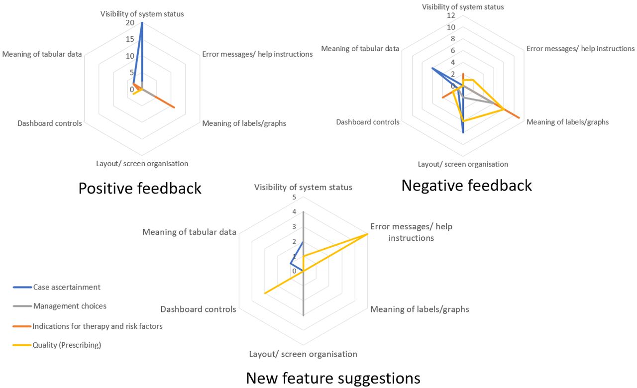
Graphical representation of feedback across the usability problem classes.
Enhancing the AF dashboard
Enhancements to the dashboard were prioritised based on the feedback provided by study participants. The section with risk scores received the most amount of negative feedback. The improved screen layout for this section is given in figure 8. The enhancements included simplifying labelling, limiting numerical information and changing nomenclature according to standards used in other national guidelines (eg, CHA2DS2VASc to CHADS2). We also included links to additional documentation that provided details about how certain values displayed in the section were calculated (eg, calculation of earnings according to the QOF scheme).
Screenshot of the enhanced version of the risk score section.
The anticoagulation dosing section was enhanced by introducing a simplified taxonomy for anticoagulant dosing which would be more insightful for practice staff (figure 9).
Screenshot of the enhanced version of the anticoagulant doses section based.
Discussion
Principal findings
This study reported on the think aloud method to assess an AF dashboard. The key finding is that case ascertainment was the section that received most overall positive feedback. Communication of overall performance using the smiley face also received positive feedback. We also found that general practitioners considered the data quality of prescribing section to be most useful to support their work. Furthermore, a key area for improvement was the better annotation of graphs, figures and tables.
While the findings of the evaluation provided an systematic approach for enhancing the dashboard, we recognise that there is potential to triangulate the findings by using a heuristic evaluation involving a group of usability experts.26 We were not able to form an expert panel to conduct a heuristic evaluation due to funding and time restrictions.
Implication of findings
The think aloud method of feedback collection provides a systematic approach to prioritise enhancements based on the needs the dashboard users. This helped with increasing adoption rates of dashboard products and in turn has a significant impact towards improving the quality of coded data available for research. As clinical implications, we anticipate that successful adoption of the dashboard will result in improved data quality, resulting in better management of AF in primary care.
Comparison with the literature
Audit-based education methods have been previously used to improve management of association to chronic kidney disease management in primary care.27 Frequent supply of routine data from general practices has allowed continuous data quality monitoring, and this has resulted in improved quality of care and disease surveillance.4 28 Similar to other studies that have incorporated user-centred design methods, our enhanced dashboard has successfully demonstrated that understanding user interactions is essential to quality improvement.29
Strengths and limitations
The RCGP RSC provides data quality feedback across a range of other conditions, such as chronic kidney disease and asthma, and strives to maintain consistency in the dashboards used to communicate feedback to practices. Possible prior exposure to some other dashboards may have influenced the results of our think aloud evaluation. We were only able to recruit a small number representing general practitioners. Nevertheless, they constituted 46% of the study group.
The concurrent think aloud approach used for the study has the limitation of being intrusive to the cognitive process over the retrospective think aloud method. This is since the process of providing a simultaneous commentary while using the dashboard will have an impact on usability.
Conclusions
We have developed an AF dashboard which has been used for assessing quality of care and reporting feedback to general practices that provide data. We had positive response from the study group that participated in the usability evaluation. The management choices and quality (prescribing) sections of the dashboard were enhanced based on feedback received during the evaluation. Our dashboard appears acceptable to primary care professionals, and such quality improvement interventions should be tested in a trial.
Acknowledgments
Practice staff from the participating Royal College of General Practitioners Research and Surveillance Centre (RCGP RSC) practices for contributing to the study. Chris McGee for the development of the dashboard, Hannah McHugh. Zarmina Butt and Noshin Ishrat for supporting the think aloud evaluation.
References
Supplementary materials
Supplementary Data
This web only file has been produced by the BMJ Publishing Group from an electronic file supplied by the author(s) and has not been edited for content.
Footnotes
Twitter @harshana
Contributors SdL conceived the dashboard and formulated this evaluation with substantial contribution from HL. SdL and HL with a substantial contribution from MF and NM drafted the manuscript. JS extracted the data for the dashboard. FF was project manager for this study. All authors contributed to and approve the final version of the paper.
Funding The work was supported by Daiichi Sankyo.
Competing interests RH has received occasional fees from Bayer and Boehringer Ingelheim for speaking or consulting on atrial fibrillation–related stroke risk.
Patient consent for publication Not required.
Provenance and peer review Not commissioned; externally peer reviewed.
Data availability statement Data are available on reasonable request. Data can be requested by contacting the corresponding author.