Article Text

Abstract
Background Methods to visualise patient safety data can support effective monitoring of safety events and discovery of trends. While quality dashboards are common, use and impact of dashboards to visualise patient safety event data remains poorly understood.
Objectives To understand development, use and direct or indirect impacts of patient safety dashboards.
Methods We conducted a systematic review in accordance with the Preferred Reporting Items for Systematic Reviews and Meta-Analyses guidelines. We searched PubMed, EMBASE and CINAHL for publications between 1 January 1950 and 30 August 2018 involving use of dashboards to display data related to safety targets defined by the Agency for Healthcare Research and Quality’s Patient Safety Net. Two reviewers independently reviewed search results for inclusion in analysis and resolved disagreements by consensus. We collected data on development, use and impact via standardised data collection forms and analysed data using descriptive statistics.
Results Literature search identified 4624 results which were narrowed to 33 publications after applying inclusion and exclusion criteria and consensus across reviewers. Publications included only time series and case study designs and were inpatient focused and emergency department focused. Information on direct impact of dashboards was limited, and only four studies included informatics or human factors principles in development or postimplementation evaluation.
Discussion Use of patient-safety dashboards has grown over the past 15 years, but impact remains poorly understood. Dashboard design processes rarely use informatics or human factors principles to ensure that the available content and navigation assists task completion, communication or decision making.
Conclusion Design and usability evaluation of patient safety dashboards should incorporate informatics and human factors principles. Future assessments should also rigorously explore their potential to support patient safety monitoring including direct or indirect impact on patient safety.
- informatics
- data visualization
- safety management
Data availability statement
Data sharing not applicable as no datasets generated and/or analysed for this study. Not applicable.
This is an open access article distributed in accordance with the Creative Commons Attribution Non Commercial (CC BY-NC 4.0) license, which permits others to distribute, remix, adapt, build upon this work non-commercially, and license their derivative works on different terms, provided the original work is properly cited, appropriate credit is given, any changes made indicated, and the use is non-commercial. See: http://creativecommons.org/licenses/by-nc/4.0/.
Statistics from Altmetric.com
Introduction
Since the 2000 release of the Institute of Medicine’s landmark report, To Err is Human: Building a Safer Healthcare System,1 healthcare organisations have increasingly gathered, analysed and used data to improve the safety of healthcare delivery. Despite increased research and quality improvement efforts, how data on patient safety events is communicated to people who will act on these data is not well understood. For instance, due to national quality reporting programmes, such as the Centers for Medicare & Medicaid Services’ Quality Payment Program,2 which adjusts healthcare organisation’s reimbursement rates based on meeting certain quality measures, dashboards have been used extensively to visualise and disseminate process-based quality measures such as understanding how well haemoglobin A1c is controlled across all of a clinic’s patients. However, an understanding of how commonly dashboards are used for patient safety-specific measures and how effective they are at advancing patient safety efforts and safety culture remains unknown.
Dashboards have been used extensively within and outside healthcare and serve as a form of visual information display that allows for efficient data dissemination.3 4 Dashboards aggregate data to provide overviews of key performance indicators to facilitate decision making, and when used correctly, enable efforts to improve an organisation’s structure, process and outcomes.4 5 For dashboards to play a strategic role in communicating patient safety data, it is essential they are designed to relay key information about performance effectively.6 Thus, the dashboard design must consider informatics and human factors principles to ensure information is efficiently communicated. Informatics and human factors approaches have been successful in the design and evaluation of user interfaces in healthcare, and have variably been applied to dashboard development.7 One common approach is user-centred design, which is an iterative design process that aims to optimise usability of a display by focusing on users and their needs through requirement analysis, translation of requirements into design elements, application of design principles and evaluation.8 Considering dashboards, usability would be defined as the extent to which a dashboard can be used by clinicians to understand and achieve specified goals with effectiveness, efficiency and satisfaction in clinical settings.9
Three main goals that guided this study were: (1) To understand the frequency and settings of use of patient safety dashboards in healthcare, (2) To determine the effectiveness of dashboards on directly or indirectly impacting patient safety at healthcare organisations and (3) To determine whether informatics and human factors principles are commonly used during dashboard development and evaluation. Our study focused on dashboards that displayed the frequency or rate of events, that is, those that facilitated retrospective review of past safety events to reduce these types of events in the future or dashboards that identified safety events of individual patients in real-time in order to mitigate further harm. We excluded dashboards that only displayed risk of an event.
Methods
Design
We conducted a systematic literature review in accordance with the Preferred Reporting Items for Systematic Reviews and Meta-Analyses guidelines.
Search strategy and inclusion criteria
We searched all available published and unpublished works in English using three literature databases (MEDLINE via PubMed, EMBASE and CINAHL). Publications were eligible for inclusion if they included discussion about a dashboard for displaying patient safety event data in the healthcare setting. Patient safety event data were based on the list of ‘Safety Targets’ (table 1) on the Agency for Healthcare Research and Quality’s (AHRQ) Patient Safety Network (PSNet),10 and excluded process measures. Because of the variety of topics within patient safety, we ultimately used only the word ‘dashboard’ in our keyword and title search of all three databases, since this maximised the number of known publications identified without excluding relevant publications. Thus, our inclusion parameters, in PICOS format, were:
Population: Organisations providing medical care.
Agency for Healthcare Research and Quality Safety Targets
Interventions: Dashboards used to disseminate patient safety data (defined as measures related to any topic defined as a ‘Safety Target’ (table 1) by the AHRQ).10
Comparators: Settings with and without the use of patient safety dashboards.
Outcomes: (1) Settings where patient safety dashboards were used and (2) Impact of use of patient safety dashboards on reducing patient safety events.
Time frame: Studies published in English from 1 January 1950 to 30 August 2018.
Setting: Ambulatory care, inpatient and emergency department settings.
Screening process
After manually removing duplicates and non-journal publications (eg, magazine articles and book chapters), two authors (DRM and TS) with expertise in clinical care, informatics and human factors reviewed titles and abstracts of each remaining article or abstract. Works were only included if they described display of patient safety event data (based on AHRQ’s PSNet list of Patient Safety Targets) on a dashboard. Publications that discussed only non-safety event-related aspects of quality (eg, haemoglobin A1c control or rates of mammography screening) were excluded. Similarly, literature on dashboards displaying risk factors to prevent patient safety events rather than events themselves (eg, intensive care screens that display a particular patient’s heart rate and oxygenation saturation or calculate a real-time risk level) were beyond the scope of this study and were excluded. We reviewed all publications potentially meeting study criteria in full. Reviewers discussed each inclusion, and disagreements regarding whether an article or abstract met criteria were resolved by consensus.
Publication evaluation
Three authors (DRM, TS and AS) independently extracted data from each identified publication using a structured review form. Reviewers specifically identified (1) the setting the dashboard was used in, (2) the patient safety topic displayed on the dashboard, (3) the type of informatics or human factors principles used in dashboard design or usability evaluation performed on the final dashboard and (4) the impact of the dashboard, both related to reducing patient safety events in the setting where it was used and other impacts identified by each publication’s authors. To assess the level of evidence in improving patient safety, reviewers also assessed the study type and whether a control or other comparison group was used. Findings are aggregated and reported using descriptive statistics.
Results
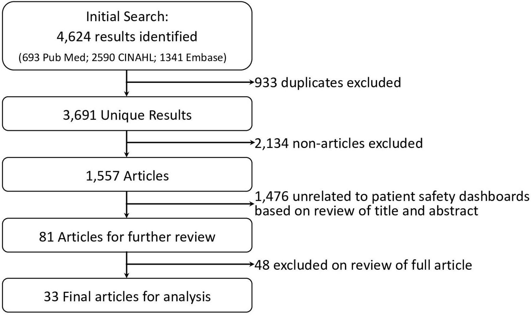
Our literature search identified a total of 4624 results (PubMed: 693, CINAHL: 2590, Embase: 1341). After 933 duplicates were removed, 3691 result entries remained. One reviewer (TS) subsequently removed 2134 magazine articles, newspaper articles, thesis papers, conference papers, reports that were unrelated to the topic of patient safety, as well as publications not in English. Titles and abstracts of the remaining 1557 articles and conference abstracts were independently reviewed by two reviewers (TS and DRM). Reviewers manually reviewed titles and abstracts and excluded (A) publications that did not include discussion of a dashboard as a primary or secondary focus, and (B) publications where dashboards were mentioned, but the dashboard did not include measures related to any of the AHRQ ‘Safety Targets’ (table 1). After exclusions, reviewers identified a combined total of 81 publications that warranted further review of the entire publication. Reviewers discussed each publication, and after consensus, identified 33 final publications that warranted inclusion in the analysis. Reference sections of each publication were reviewed for additional sources but did not identify additional publications. Figure 1 displays a flow chart of the search strategy.

Flow chart of literature search results and the selection process of accepted/excluded publications.
Search results
The final set included 33 publications, including 5 conference abstracts and 28 full articles (table 2). The earliest publications describe use of patient safety measures on a dashboard in 2004, 2005 and 2006,11–13 followed by a paucity of additional publications until 2010.
Final studies using patient safety dashboards identified during literature search
Clinical settings
All patient safety dashboards were used in the hospital setting, often at the level of the entire hospital or hospital system. Several patient safety dashboards were used in ICUs,12 14–16 hospital wards,11 12 17–22 pharmacies,21 23 emergency departments and trauma centres,24–26 and surgical settings.12 27 28 No use of patient safety dashboards was identified in the ambulatory care setting.
Patient safety topics
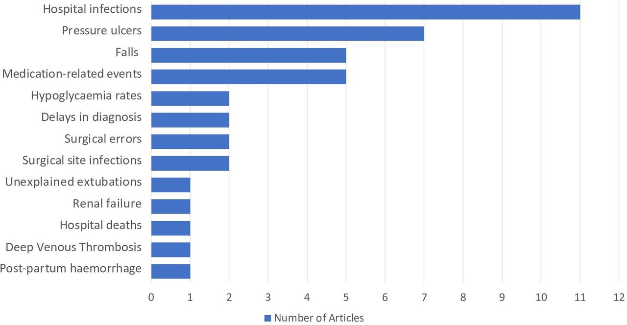
The most common use of patient safety dashboards (11 of 33) was tracking hospital infections (figure 2). Types of infection tracked included central line-related blood stream infections,14 16 29–31 ventilator-associated pneumonia,14 16 29 30 32 catheter-associated urinary tract infections,14 29 30 33 methicillin-resistant Staphylococcus aureus infections,29 30 34 vancomycin-resistant Enterococcus infections30 and Clostridium difficile infections.29 30 Dashboards additionally displayed rates of pressure ulcers,11 12 14 20 22 34 35 patient falls11 29 36–38 and medication-related errors,13 18 23 39 40 followed less commonly by other patient safety topics (See table 2 for all safety topics and figure 2 for chart of topic frequencies).
Number of publications identified by dashboard patient safety topic.
Impact of Dashboard use and level of evidence
Of all studies identified, 5 used a time series design15 18 28 35 41 while the remaining 28 used case report designs describing specific implementations of patient safety dashboards without statistical analyses performed. Of the five time series studies, Coleman et al18 identified a 0.41% decrease in missed doses of medications other than antibiotics (p=0.007); however, it was part of four concurrent interventions to reduce missed and delayed medication doses, and thus, the specific impact of the dashboard was unclear. Similarly, Milligan et al41 reported a reduction in hypoglycaemic rates, Rioux et al28 reported a decrease in surgical site infections over a 6-year period after dashboard implementation, and Mackie et al35 reported a reduction in hospital-acquired pressure ulcers; however, in each case, the dashboard was one aspect of a broader campaign to reduce the respective patient safety events. Other studies, including Bakos, Chandraharan, Collier, Conway, Hebert, Hendrickson and Hyman,15 17 22 24 25 30 37 reported a subjective reduction in patient safety events, but did not describe a statistical analysis. The remaining publications did not include discussion of the direct or indirect impact of the dashboard on patient safety events.
Most publications that evaluated the dashboard focused instead on sensitivity and specificity of dashboard measures, employee satisfaction with the dashboards and reduction in time required to gather data for the dashboard compared with previous manual data collection. Another impact of dashboards described included dissemination of patient event data in real time or closer to real time than previously possible due to algorithms that monitor electronic patient safety data and automatically update dashboards. Direct impact on culture and staffing levels of patient safety personnel were not described in any of the studies. However, as described above, several studies implemented dashboards as a package with other patient safety-focused efforts, suggesting changes in culture, infrastructure, and staffing likely occurred, but concomitantly with the dashboard implementation rather in response to it.
Usability
Only two studies used a human factors approach for design and evaluation of dashboards. Ratwani and Fong38 described a development process employing commonly accepted human factors design principles,42 followed by focus groups with users and a 2-week pilot phase to collect usability data and make improvements to the dashboard. Mlaver et al20 used a participatory design approach that employed collaboration with users during iterative refinements. Two additional studies discussed more limited efforts to obtain feedback. Dharamshi et al27 performed a limited usability analysis with an anonymous survey of dashboard users at 6-months after implementation to understand factors that limited the usability of the dashboard. Stone et al40 iteratively obtained feedback from physician users between dashboard revisions. However, the majority of studies did not describe the use of an informatics or human factors approach that considered usability design principles, user-centred design processes or usability evaluation methods. Thus, there was little evidence of design elements that were most useful or usable across scenarios or settings.
Discussion
Our systematic review identified 33 publications discussing the use of dashboards to communicate and visualise patient safety data. All publications were published since 2004, suggesting increased measurement of patient safety after the 1999 publication of To Err is Human. All publications involved display of patient safety events in the inpatient setting, the most common of which were hospital acquired infections. There may, thus, exist opportunities for similar efforts in the ambulatory setting (eg, falls, lost referrals, abnormal test results lost to follow-up or medication prescribing errors).
Overall, the level of evidence that dashboards directly or indirectly impact patient safety was limited. Only five of the publications used time series designs with the remaining designs comprised of case reports of dashboard implementations either alone or as part of broader patient safety interventions. No interventional studies were identified. Most studies reported on accuracy of the measures displayed or survey-based user satisfaction with the dashboard, rather than the dashboards’ impact on patient safety events. Studies that provided data on reductions in patient safety events either did not report statistical analyses to support the reduction, or more commonly, were part of a broad process improvement effort containing multiple interventions, making it difficult to tease out which intervention truly impacted safety. While it can be argued that the intent of a patient safety dashboard is to communicate data about the extent of safety issues at an organisation and support other improvement efforts, the act of showing data via a dashboard may alone have an impact of motivating quality and safety efforts. Dashboards likely have impacts on safety culture and indirectly lead to allocation of resources to reducing patient safety events. The studies identified did not describe these impacts in response to dashboard implementation, and thus, this topic warrants future exploration.
Most publications described dashboard development as a quality improvement approach to addressing a specific organisational problem or to meet institutional or national standards. Several studies reported high user satisfaction with the dashboard, though these were often limited assessments and did not capture whether users fully understood the content of the dashboard. With four exceptions, studies lacked informatics or human factors design approaches during development, application of standardised design principles and use of usability evaluations. Without informatics, human factors or user-centred design approaches, information requirements from users may not be well understood. Thus, there is limited evidence about the dashboard acceptance, frequency of use or whether dashboards satisfactorily met the needs of intended users. For example, a common mention was use of colour coding following a traffic light scheme (red=poor status, yellow=warning, green=good status), without a formal evaluation of the usability for the 8% of men and 0.5% of women in the population with red-green colour blindness.43
Some dashboards were implemented within a bundle of other interventions. The lack of dashboard usability testing before and after implementation made it difficult to identify the impact or effect of the dashboard. As with many clinical informatics interventions, there could be numerous social and/or technical factors that may have influenced the reported outcomes beyond the dashboard. Rigorous informatics and human factors design approaches44–47 are needed to improve the use and impact of patient safety dashboards. Because intervention development is often time constrained, rapid qualitative assessment approaches or human factors methods involving rapid prototyping,48 49 for example, can be adapted to meet the shorter timelines needed for rapid cycle quality improvement. This will ensure dashboards are useful and usable and generate much needed evidence about efficiency, effectiveness and satisfaction in various care settings.
Our study has several limitations. First, it is subject to a potential reporting bias. While we analysed publications based on the content reported, it is possible that additional statistical analyses and usability assessments were performed that were not reported. Furthermore, there is likely to be greater use of patient safety dashboards developed as part of routine quality improvement efforts within healthcare organisations, but these may not be published. Nevertheless, this is an area that is ripe for additional research. Second, there was a significant variability in how dashboards were described, ranging from basic text descriptions to full-colour screenshots. This variability made performing standardised usability assessments impossible. Finally, our search was limited to the publications present in the databases we searched. While we used three different databases to mitigate this impact, if publications did not appear in any of our search databases, they would have been missed.
In conclusion, we identified a growing use of patient safety dashboards, largely focused on displaying inpatient safety events. Due to limited use of informatics and human factors-based approaches during development or postimplementation evaluation, the usability of such dashboards was difficult to assess. Furthermore, because of limited evaluation of the impact of dashboards and because dashboards were often implemented as part of a variety of process improvement efforts, the literature is not clear on direct impact of dashboard implementation on patient safety events. Because well-designed dashboards have potential to support patient safety monitoring, our study should encourage integration of informatics and human factors principles into design and usability evaluation of dashboards as well as assessment of their direct or indirect impact on patient safety.
Data availability statement
Data sharing not applicable as no datasets generated and/or analysed for this study. Not applicable.
Ethics statements
Patient consent for publication
References
Footnotes
Twitter @DeanSittig, @HardeepSinghMD
Contributors DRM, DS and HS developed idea for this systematic review. DRM and TS performed the literature search. DRM, TS and AS critically reviewed and extracted data from the publications identified. All authors contributed to the writing of the initial manuscript and of revising subsequent versions. All authors had control over the decision to publish. DRM had access to the full data set and accepts full responsibility for the finished article.
Funding This project was funded by an Agency for Healthcare Research and Quality Mentored Career Development Award (K08-HS022901) and partially funded by the Houston VA HSR&D Center for Innovations in Quality, Effectiveness and Safety (CIN 13-413). HS is additionally supported by the VA Health Services Research and Development Service (IIR17-127; Presidential Early Career Award for Scientists and Engineers USA 14-274), the VA National Center for Patient Safety, the Agency for Health Care Research and Quality (R01HS27363), and the Gordon and Betty Moore Foundation (GBMF 5498 and GBMF 8838). AS is additionally supported by the VA HSR&D Center for Health Information and Communication (CIN 13-416), National Institutes of Health, National Center for Advancing Translational Sciences, and Clinical and Translational Sciences Award (KL2TR002530 and UL1TR002529). There are no conflicts of interest for any authors.
Disclaimer These funding sources had no role in the design and conduct of the study; collection, management, analysis, and interpretation of the data; and preparation, review, or approval of the manuscript.
Competing interests None declared.
Provenance and peer review Commissioned; externally peer reviewed.